Call-tracking product design
Category


Challenge
After completing the discovery phase for call-tracking solution, our team proceeded to the second stage of platform development – digital product design.
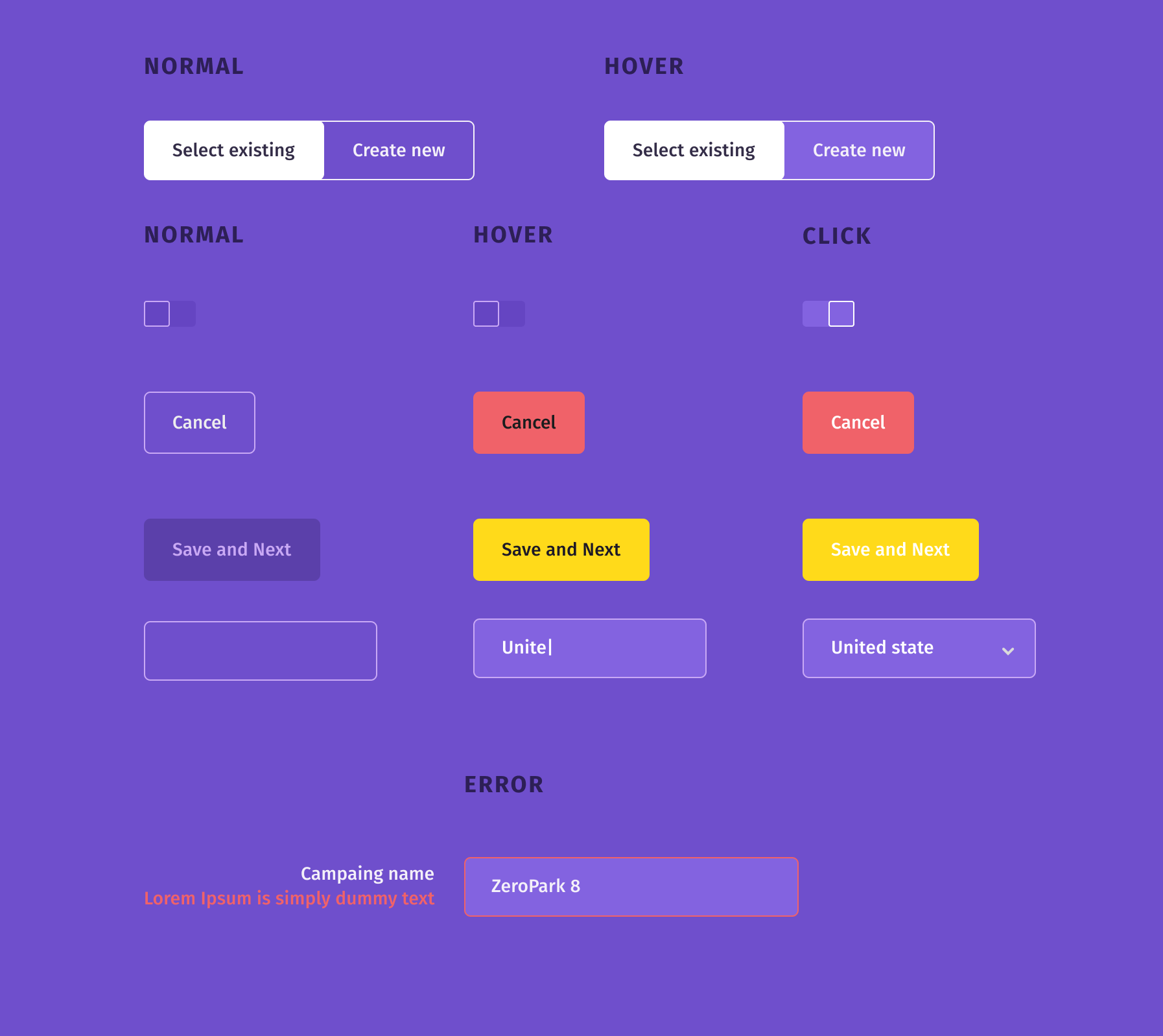
The main goal was to create an unique interface so that people could easily start working with the application in full. The user interface had to be:
- Сlear and simple;
- Intuitive;
- Solving the client’s problems;
- Having a fast and easy onboarding process.
Solution
At the first stage, we created a user-flow, a flowchart of the application.
At the second stage, we made sketches (wireframes). We decided that each team member would create their own Wireframes, after which we would all together choose the best solutions. This helped not to focus on 1 option, but to experiment and choose the best one.
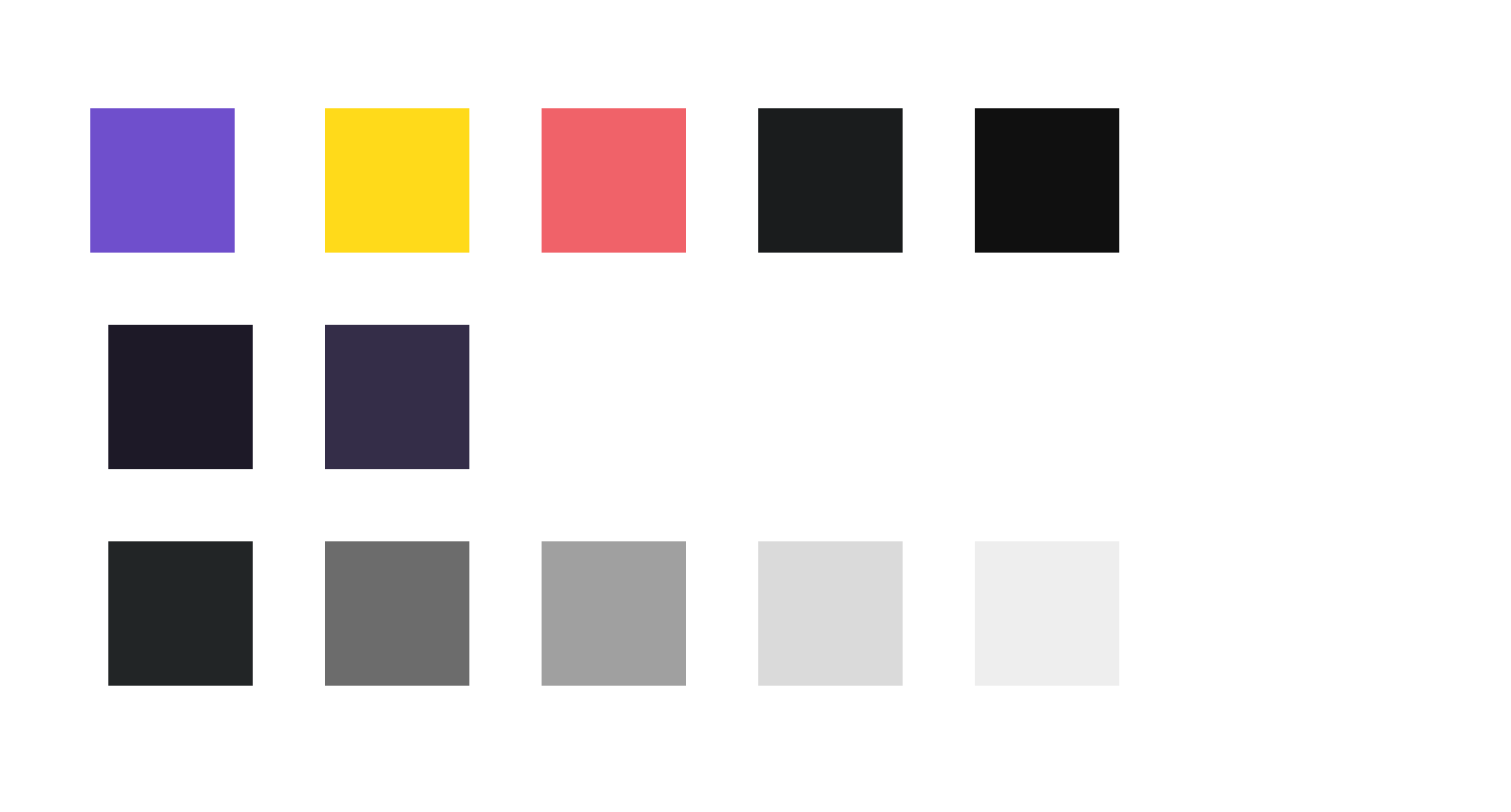
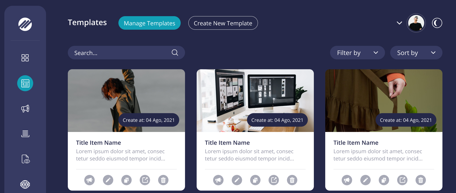
The color palette was chosen taking into account the use of 2 versions of the interface, white and dark (the dark and light versions allow you to effectively work with the interface in daylight and dark hours and are designed to protect users’ eyes from stress and discomfort). So primary colors had to look equally good on both versions and focus the user’s attention on important interface elements.
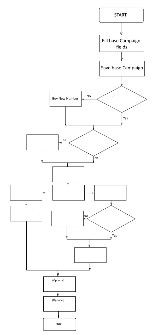

After choosing the color scheme, the team created user flow for the future solution, and worked out different options for user behavior.
At the final stage, the designer presented ready-made page layouts, after the analysis of which, minor adjustments were made before product development.
ITSDev team decided to avoid a lot of pop-ups and use progressive disclosure instead of them as a large number of pop-ups could annoy customers and distract the user’s focus from major features.
*The diagram shows a step-by-step process for creating an advertising campaign.
Screenshots
Project size
1 Business Analyst
1 UX/UI Designer
1 Senior Engineer
Duration
2 weeksCategory


Ready to start?
We would love to hear your ideas


Zaur
Please fill in the requested information and we will contact you soon.
 Let's discuss how we
can help your business