Landing page software product redesign
Category


Challenge
After completing the mvp development for MoneyPageApp, our team proceeded to the next stage – product redesign phase.
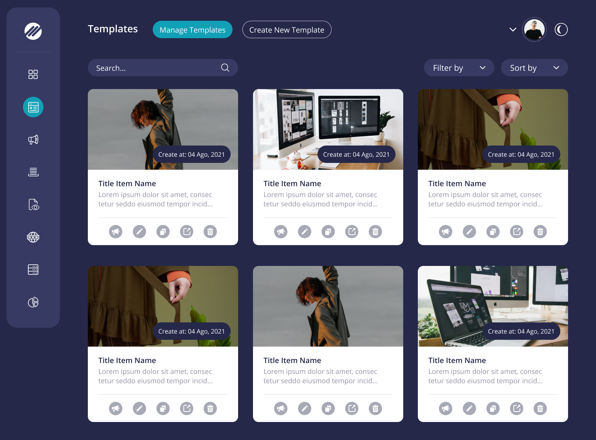
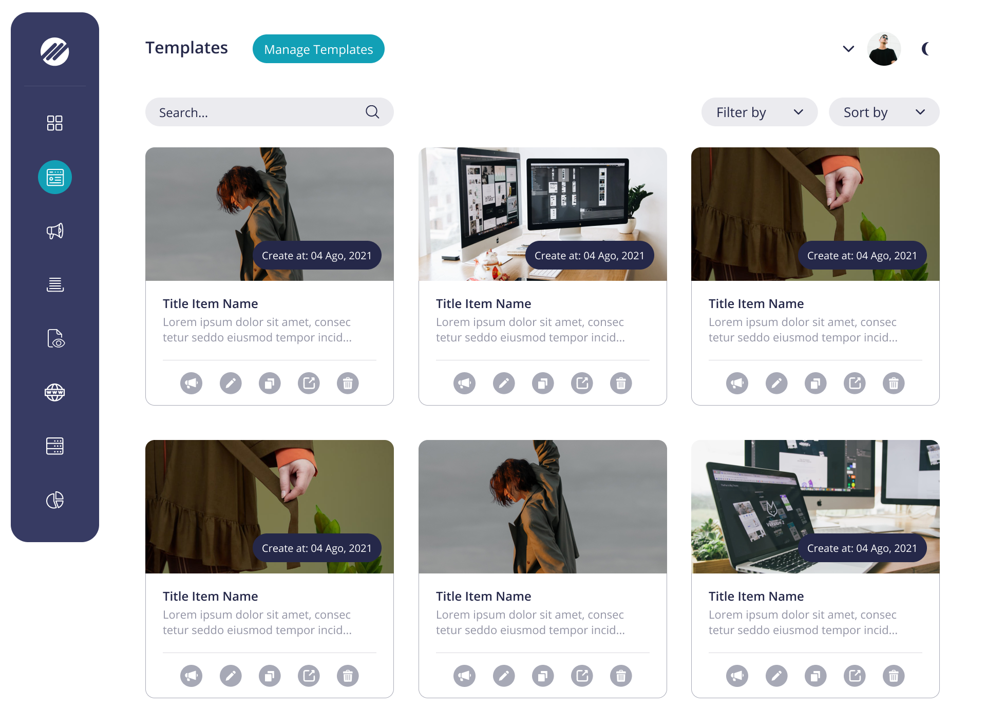
It was necessary to make a more attractive and customer-oriented design. The old design was made in dark colors, basic ones for the UI library, that our developers used to speed up the development of the MVP version.
Solution
At first, we started with a selection of colors for the website and our UX team decided to use two themes (dark and light ones) so that they looked equally good on any screen and do not cause discomfort to the eyes of users.
The following colors had been identified:
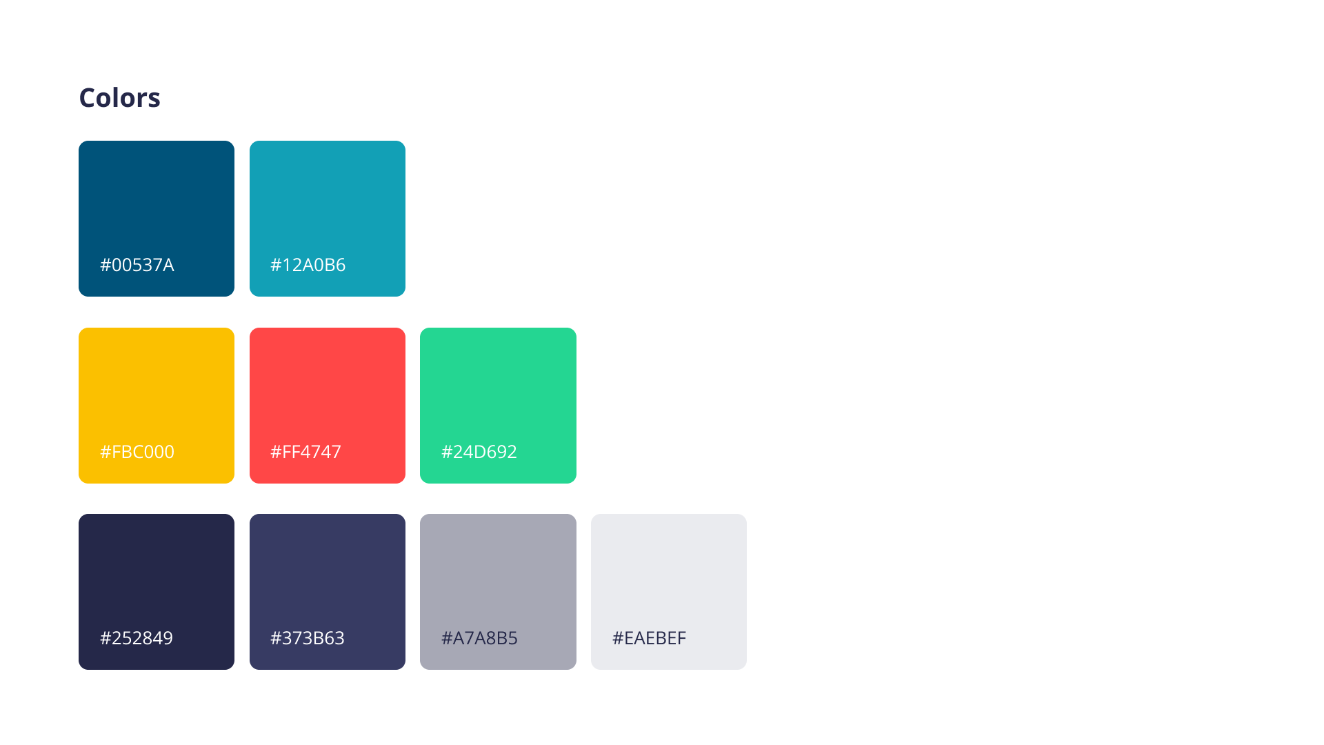

The use of light and bright colors had a positive effect on product usability and visual appeal.
Besides, to give volume to the elements in comparison with the right corners we made all the elements with rounded ones.
We also decided to ditch pop-ups whenever possible and use progressive deployment on the page instead.
In addition, a UI Kit was developed for the client so that when developing a future functionality, he did not have to resort to the services of a designer again, which would save him time and money. In the UI Kit, we paid special attention to application elements such as buttons, icons, cards, tables.
Screenshots
Project size
1 UX/UI Designer
1 Team Lead
1 Business Analyst
Duration
1 monthCategory


Ready to start?
We would love to hear your ideas


Zaur
Please fill in the requested information and we will contact you soon.
 Let's discuss how we
can help your business